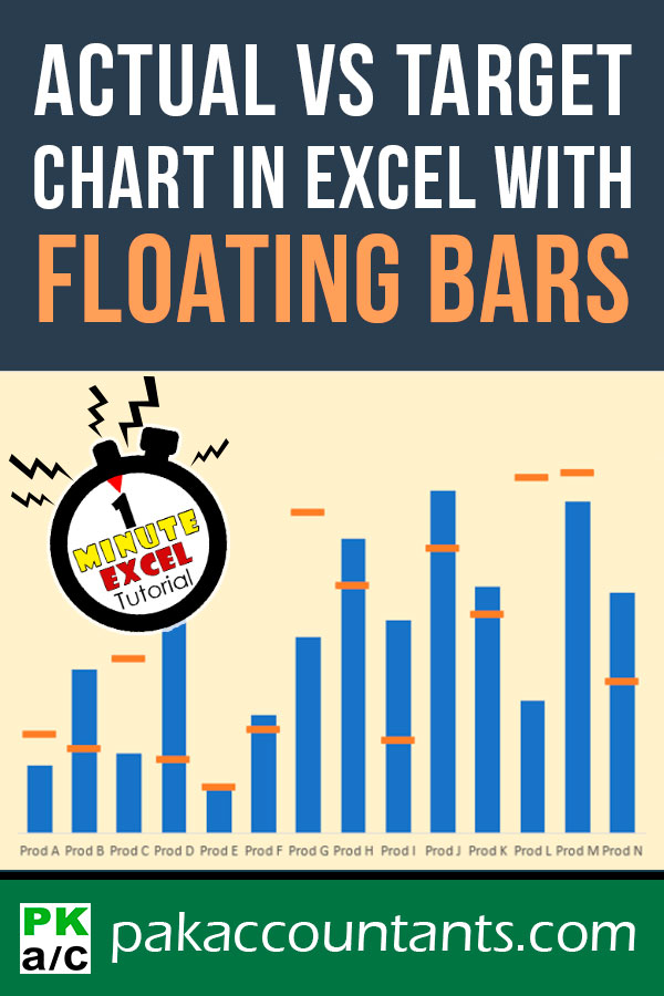
So we are making this awesome Excel variance graph, the easiest actual vs target chart with floating bars, in 5 steps under 1 minute:
In this tutorial:
Excel Actual vs Target chart in 30 seconds or less!
Download the Practice Workbook: Join *FREE* Excel Maven Program and get access to tutorial files for this post.
File name: 0187 Variance Chart with Floating Bars.xlsx
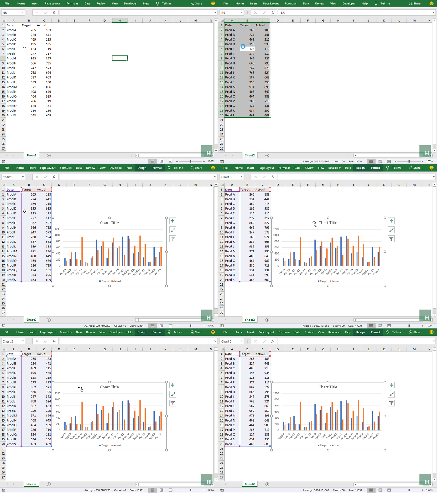
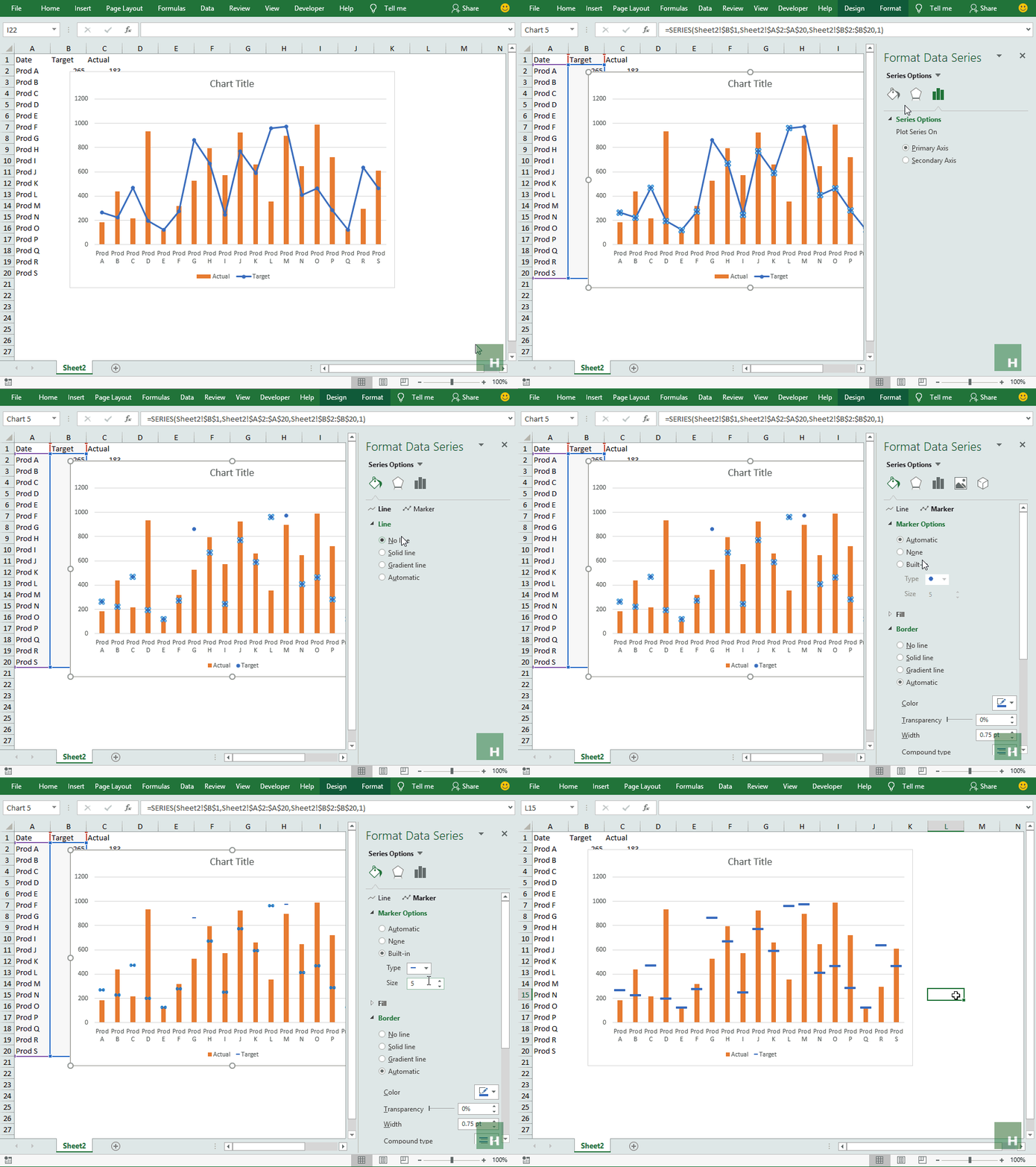
Step 1: Open the downloaded practice workbook. Have an active cell inside data and Hit CTRL+A to select the data and then hit ALT+F1 to insert clustered column chart instantly.
Step 2: Having the chart active, go to design tab > click change type button. A new window will pop up. Select combo from the list on the left > change chart type for target series line with markers > Click OK.
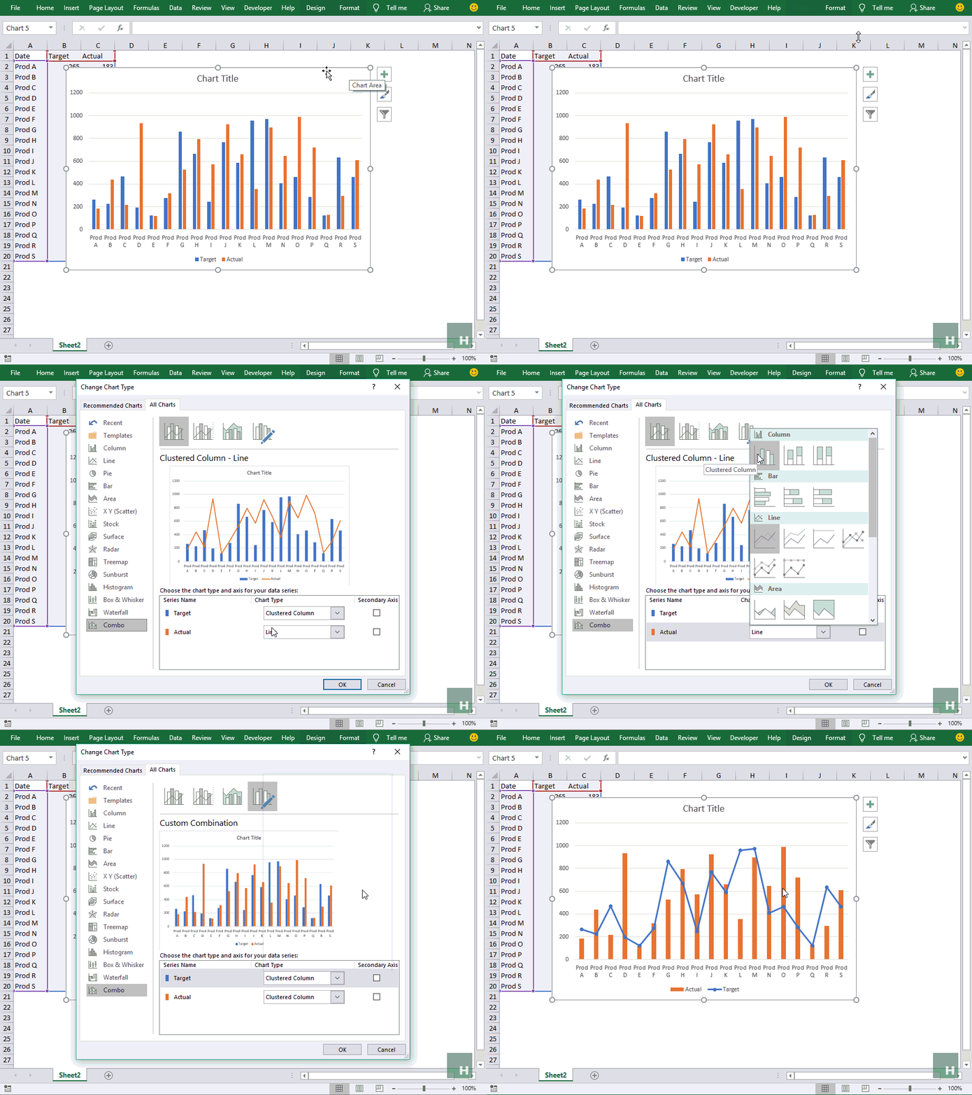
Step 3: Right-click on the line series in chart > Click Format data series > From the bar on the right click Fill and line icon > Under line select No line
Step 4: Click Marker > Expand Marker options > Click Built-in > From the drop-down select the marker you like, I went with dash as its more visible on the chart. Increase the size to 15.
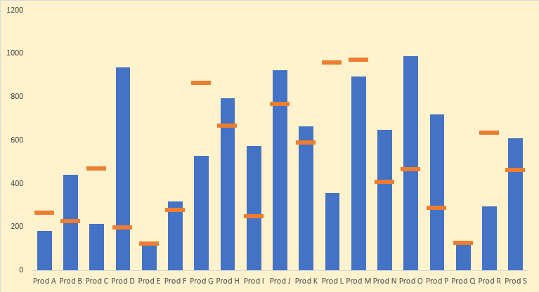
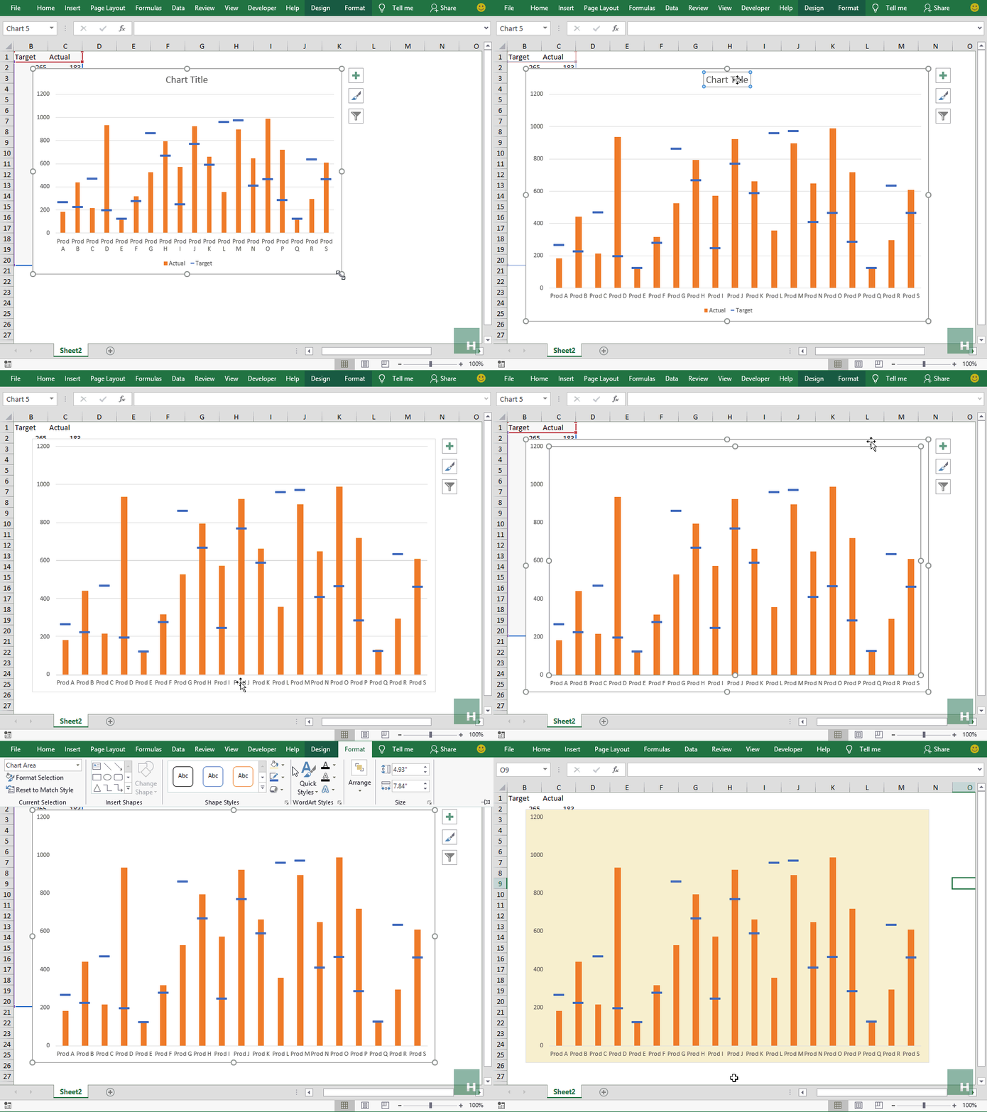
Step 5: Remove the chart elements you don’t need. I removed almost everything from title, label, and gridlines to have the following result:
Blazing fast charting in Excel! I mean accountants and analysts have a lot to rejoice and this is one example 🙂
Liked the tutorial? Pin it!